


Overview
Purpose & Context
The aim of this project was to create a researched and tested mobile expert app that enables anyone, anywhere to chat with an expert in a specific field as my final project for my UX Immersion program at CareerFoundry. During the lockdown, I found myself cooking at home a lot, but was struggling to master some of the harder recipes I was finding. Therefore, I was inspired to develop an app that would allow me to book a cooking consultation with a professional chef who could help walk me through the various steps and share helpful tips along the way. During my research, I found that no expert cooking app exists, and there was a need in the market that Chop could fill.
App Summary
Chop is a cooking expert app that allows users to connect virtually with a professional chef via chat, phone or video call to solve all their culinary needs. Whether you need help with a tricky recipe or want to improve your basic cooking techniques, top chefs are just a click away.
Think of the concept behind Airbnb, but instead of searching for the perfect apartment and booking your getaway, you are searching for an expert chef and booking a virtual lesson!
Tools
Pen & Paper, OptimalSort, Survey Monkey, Usability Hub, Adobe XD, Adobe Photoshop, Adobe Illustrator and Adobe Indesign.
Role
UX/UI Designer
Timeline
July 2020-Jan 2021
The Process
This process may appear to be linear, but it is in fact, an iterative process based off of constant user feedback and testing.
Throughout the 7 months this product took to develop, I implemented a user-centered design thinking process that focuses on solving user needs and pain-points while also prioritizing the business requirements.


Identifying the problem
Solution
A service that functions across various platforms and allows users to specifically to connect with culinary experts to help them perfect a simple recipe or technique, and allow them to customize it to their dietary needs.
Problem Statement
Our home cooks need a way to connect with a professional chef because they wish to learn how to cook a new dish or master a new culinary skill. We will know this to be true when we see how many users are connecting to experts and when they have given a successful rating post-session.
Checking out the market

Competitor Analysis
There is currently no other cooking expert apps available. Therefore, I chose to review a mix of cooking apps and other expert apps. While Analyzing everything from style, to user reviews, to identifying pain points that I personally discovered while testing the various apps, I was able to gain a complete picture about where Chop could fill a need in the market.
Learning about potential users
User Surveys
Now that I knew there was a place in the market for Chop, I needed to do a little digging to establish my target market and learn their behaviors, likes/dislikes, and pain points. I first conducted a user survey with 53 participants to lay the groundwork. From these results, I was able to draw conclusions about various habits and preferences, and it helped establish a direction for my further research.
User Interviews
Armed with the data from my user surveys I was able to conduct a remote interviews with 3 different participants ranging in age, gender and cooking ability. By differing my participants I gained insight into various cooking habits and what users would like to see from an expert cooking app.
I also inquired about their current pain points they have when cooking a meal in order to get to the root of their culinary needs.
Analyzing the research

Affinity Mapping
Now that I had collected all the data, it was time to organize and analyze it. To do this, I used affinity mapping to sort, group and identify user insights that reoccured between the different research participants.
For each participant I reviewed the recorded footage from the interviews and created sticky notes featuring bits of personal information and quotes. I then grouped these notes into 3 personal categories: Behaviors/Attitudes, Needs/Goals and Frustrations.

Now that each participant had its own map, I could move to the next step of combining their feedback into general categories. After several different regroupings I ended up with 7 categories to find similarities to then help me develop user personas in my next step.

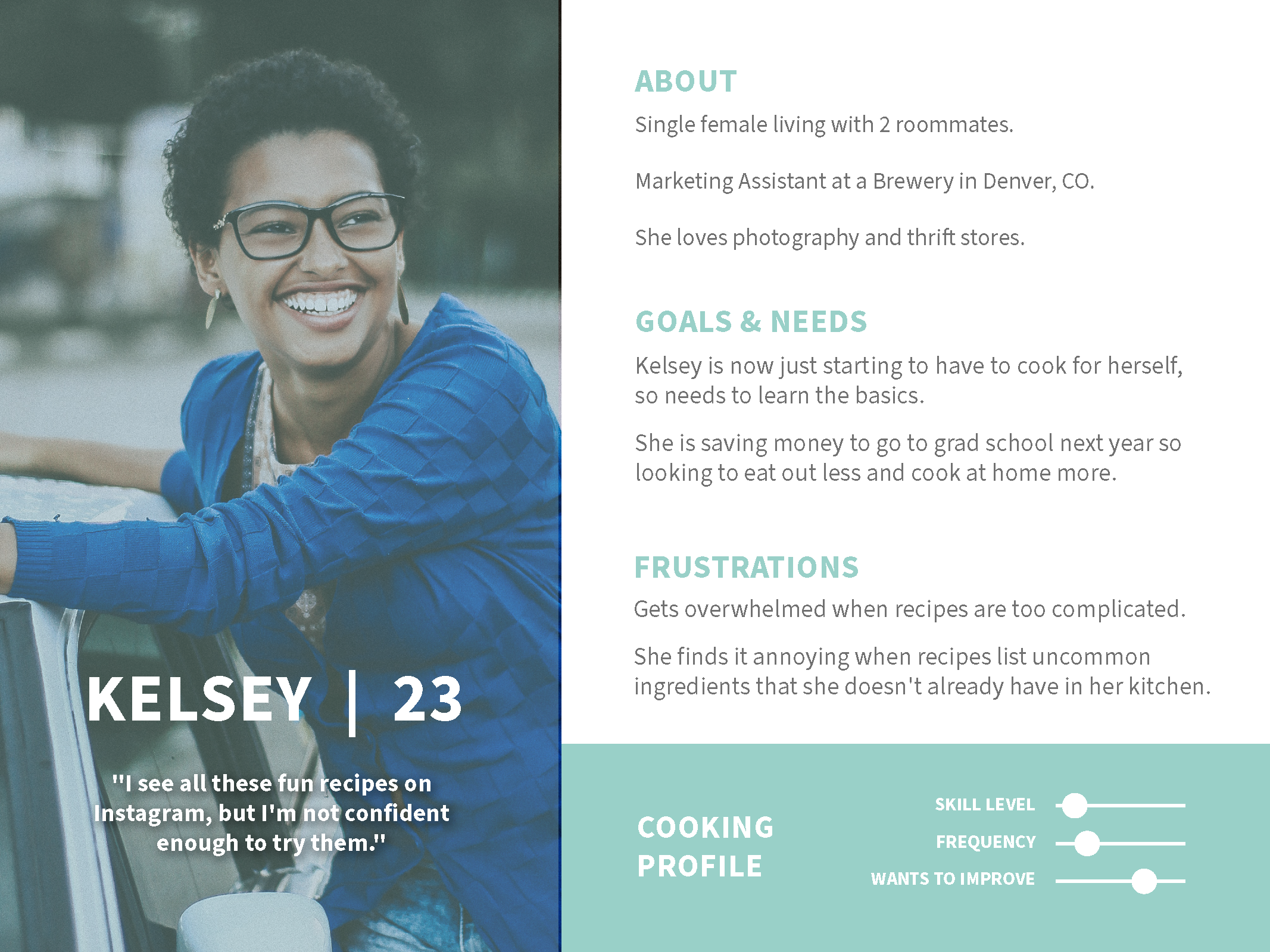
Meet our users: Kelsey, John & Prisha
User Personas
Over the next month, I really brought Kelsey, John and Prisha to life providing them with backstories, hobbies, goals & needs, frustrations, and of course, their varying cooking abilities.
Based off the data I had acquired from the surveys, interviews and the discoveries from my affinity mapping, I then developed 3 user personas to embody the various key target markets that would be using Chop.


User Journey Maps
After building out each of their user stories, I created user journey maps to visualize the process that each of my personas would take while trying to complete their task while using chop. Each user had a different goal which allowed me to examine the potential emotional states that users would encounter as they moved through the app.
This was a crucial step for then developing user flows in the next step.
User Flows
Now that I had identified what task each user needed to complete, it was time to get to the drawing board and actually visualize the exact steps users would need to take within the app to reach their goal.
These allowed me to begin to envision the different screens, prompts, buttons that would soon be coming to fruition!
Time to start building
Informational Architecture

After re-reviewing competitors and other cooking sites, I created the first draft of Chop’s sitemap. With the home/explore page displaying Recipes of the Day along with free cooking tutorials.
Then there were 6 top level navigations:
Chefs: which would display all the available chefs to book
My Sessions: where users could view all past and upcoming sessions they have booked
Tutorials: to view all saved videos users had viewed and saved from the Explore/Home page.
Inbox: where all of the incoming messages and correspondences between chefs will be.
Settings: allowing users to edit their profile details, payment methods, etc.
About: information about Chop.
Card Sorting
I conducted a closed card sorting session in which 5 participants sorted 21 cards into 6 different categories.
While this sitemap made sense to me, it was time to validate my hypothesized categorization with a round of card sorting.

Site Map Iterations
However, I discovered a few areas I could tweak to make them more intuitive to the user and hopefully remove any future friction points.
For the majority of the categories, the results of the card sorting session validated my original site organization.

Iterations made to the site map:
Instead of Recipe of the Day, I’ve decided to display “Recommended Recipes” on the Explore Page, then below that “Trending Video Tutorials”.
Change “Tutorials” from the top tier navigation and change that into “Saved Posts” which on the website and app will be symbolized with a heart icon.
"My Sessions" will now become "My Lessons" as the terminology seemed to be confusing to some users.
“About” was removed from top navigation and will now only be featured in the footer on the website.

Finding inspiration
Mood Board
After making Chop’s mood board, I found that while searching through food apps and pictures that I was drawn to brighter food images. Upon completion of this, I was set on incorporating clean lines, white space and a pastel color scheme for Chop. Now it was time to put it into action!
As a graphic designer, it’s engrained into me that before I can start a project, I have to put together a quick mood board. It helps me to visualize colors schemes, potential layouts, and discover certain elements that I would like to incorporate into my own work.

Bringing Chop to life
Sketches & Mid-fidelity Wireframes
I began with sketches in order to feel out the basic elements and screen layout without getting caught up in the details. Once I was happy with the overall impression of the sketches, I translated those into mid-fidelity wireframes using Adobe XD.
Research is done, personas are thriving, the site map and user flows have already gone through several iterations; it’s now time to take pen to paper and start sketching out what we will one day come to know and love as the app Chop!

Prototyping
Examples of the screens with explanations of the specific iterations below. Once the prototype screens were polished, it was time to see what users thought of it!
Now that the user flows were officially in a digital form, it was time to start adding more detail so testing could commence. In this round of iterations I focused on building out the onboarding process so the user’s home feed would be more personalized to their preferences.


Putting it to the test

Conducting first round of user testing
As Chop was morphing into something beyond my scribbles on a piece of paper, I was eager to see how others navigated through the app. I conducted 6 moderated remote tests in which I could see the participants’ reactions as well as capture their screen movements as they completed 3 different tasks.
I built out a usability test plan that provided my stakeholders with an overview of what I was going to be doing, and how I was going to measure the results.
I also wrote out a test script to ensure each testing session was conducted in the same manner and followed exactly the same flow in the hopes of yielding the most accurate results.
Analyzing test results
Once these notes were grouped, I was able to transfer this data into a Rainbow Spreadsheet that easily allowed me to classify and rank errors based on severity level so I could see where I needed to focus my attention during the next round of iterations.
After 6 insightful interviews, I once again turned to my trusty sticky notes. While reviewing the video recording of the interviews, I jotted down any errors the participants encountered, observations I had made, negative feedback and positive quotes.
Iterations. Iterations. Iterations.
However, several friction points were discovered and suggestions were proposed as they were using Chop. Below are examples of 5 key issues that we encountered and the iterations that followed.
The overall impression from the test was very positive, and the participants seemed eager to learn more about the product. The navigation of the app was proving to be intuitive and the ease with which all 6 participants completed the tasks validated my current design decisions.

Issue 1: Skipping the onboarding process
Problem (Medium): Although not technically wrong, 3 of the 6 users immediately went to click "Start Cooking" instead of reading the onboarding screen.
Change: Based off user feedback, the onboarding isn't needed and just makes the opening screen cluttered, so cut it completely to focus on Sign Up button and making the onboarding process more enjoyable for the user.

Issue 2: Adding Allergy Question
Problem (Medium): 2 users asked if there was anywhere they could input their allergies or intolerances in addition to their dietary preferences.
Change: I have added an additional screen to the introduction section asking for potential allergies or intolerances to help further customize the user's home feed to fit their preferences.
Issue 3: Unclear layout of Chef Profile Page
Problem (High): All users took a minute to locate the "Book A Lesson" Button on the chef's profile page as originally they had to scroll all the way down to the bottom. They also wanted to know the chef's speciality dishes.
Change: I moved the button up to the top of the page so it is easy to find, and added a scrolling image library of the chef's top dishes behind their profile picture.
Issue 4: Unknown Timezone
Problem (High): 2 users asked how would they know what time zone the lesson was taking place in.
Change: I have added the time zone to the booking page as it will auto-populate to where the user is currently located. It is listed with an info button that will produce a pop-up box if the user clicks on the icon.
Issue 5: Confused for next step
Problem (High): 3 users asked how they will know what comes next once the booking is complete.
Change: I added more text to the confirmation page instructing the users on where to look for their upcoming correspondence with the chef and further details regarding their lesson.
Which do you prefer?
Preference Testing
I decided to test 2 different versions of my sign-up screen to determine the color scheme I planned to incorporate into the design for the rest of the app. In total 14 people participated in the preference test, and based off their feedback I chose to work with option A.
As the prototype continued to develop there were certain elements I was undecided about. So, who better to ask for an opinion than Chop’s future users?


Let’s add some flair
Finalizing the Style Guide
So now it’s time to lock in the UI elements and finalize Chop’s style guide.
Testing is going well, and all major errors were addressed with various rounds of iterations.


Keep the feedback coming!
User Feedback Session
5 people participated in an unmoderated remote test of the interactive prototype, and left feedback in the comments touching on everything from design aesthetic to functionality.
Now that the UI elements had been incorporated, Chop was finally starting to feel like a real app. However, at this point I had been staring at the same screen designs for too long, it was time for a fresh set of eyes (or 5)!

Largest Iterations
Lesson duration was too short: Previously I had set the lesson in increments of 15 minutes, but after the 3/5 participants expressed concern that a 15 minute session wouldn’t be enough time to cover a topic. I agreed and decided to increase the increments to 30 minutes.
Displaying Chef’s Top Dishes: Overwhelming feedback on how to include a chef’s most requested dishes, so I decided to add a whole separate section to the chef’s profile.
Key Take Aways
The more user testing and feedback the better! Quick rounds of iteration and testing lead to problem-discovery and solution-creation and truly validate all design decisions made along the development journey.
Keep it simple until you’ve worked out the kinks! To not get caught up in small details while needing to still focus on big-picture.
Next Steps
The next steps for chop will involve building out more user flows and the other various areas of the app such as the lesson portal. Once these have been developed, it will be ready for hand off to developers.
As the app continues to develop, it will undergo constant user testing and iterations to continue to validate design updates.
